Teach your students how to create and interpret bar graphs

bar_graph_example3.jpg

Learning Intention / Overview

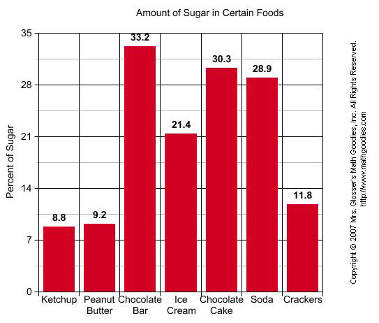
In this activity students will develop an understanding of bar graphs.  A bar graph uses horizontal or vertical bars to organize and display data for quick easy generalizations.  The bars represent amounts or qualities of things being compared.

Methods / Teaching Strategies

Individual Practice

Group Discussion

Personalized Learning Task

Assessment of Learning

Bar Graph Sheet (included)

Individualized Learning (Student Bar Graphs)

Performance Task 1 and 2

Click here to download the free 7 page lesson plan

GeoGebra Free mathematics software for learning and teaching

GeoGebra is free and multi-platform dynamic mathematics software for all levels of education that joins geometry, algebra, tables, graphing, statistics and calculus in one easy-to-use package. It has received several educational software awards in Europe and the USA.

Quick Facts

  • Graphics, algebra and tables are connected and fully dynamic
  • Easy-to-use interface, yet many powerful features
  • Authoring tool to create interactive learning materials as web pages
  • Available in many languages for our millions of users around the world
  • Free and open source software
  1. Get started with the Geogebra Introductory Materials
  2. Ask questions in the Geogebra User Forum
  3. Check out our ready-to-use Geogebra Learning Materials

GeoGebraWiki

is a free pool of teaching materials for the dynamic mathematics software

GeoGebra

. Everyone can

contribute and upload materials

! All contents of this pool may be used

free of charge

.

Microsoft Maths 4.0 - Now Totally Free for Teachers and Students

Microsoft Mathematics provides a set of mathematical tools that help students get school work done quickly and easily. With Microsoft Mathematics, students can learn to solve equations step-by-step while gaining a better understanding of fundamental concepts in pre-algebra, algebra, trigonometry, physics, chemistry, and calculus.

Microsoft Mathematics includes a full-featured graphing calculator that’s designed to work just like a handheld calculator. Additional math tools help you evaluate triangles, convert from one system of units to another, and solve systems of equations.
For the first time this is now totally free and available here

Lesson Plan: Surveying Data and Creating a Graph

This is a single lesson aimed at upper primary aged students (aged 9 -12 ) about collecting data, creating graphs and analysing the data you have collected.  All of the resoruces are contained within the planner.

Download the entire PowerPoint Presentation here. (recommnded)

Download a PDF of the lesson plan here.

View more presentations from Kevin Cummins.

•This lesson will assist students in further developing their knowledge of fractions, decimals and percentage.

•The data collected can also be used in developing an understanding of graphical representation in the form of graphs; for example: Pie, linear, bar graphs etc.

Lesson Plan: Surveying Data and Creating a Graph

This is a single lesson aimed at upper primary aged students (aged 9 -12 ) about collecting data, creating graphs and analysing the data you have collected.  All of the resoruces are contained within the planner.

Download the entire PowerPoint Presentation here. (recommnded)

Download a PDF of the lesson plan here.


Lesson plan survey and data generation
•This lesson will assist students in further developing their knowledge of fractions, decimals and percentage.
•The data collected can also be used in developing an understanding of graphical representation in the form of graphs; for example: Pie, linear, bar graphs etc. 

Google Public Data Explorer - An excellent maths resource

Just found this today and I would definitely recommend taking a look at it with your students especially if you are looking at chance and data.

Google Public Data Explorer, a part of Google Labs experiments, is a tool that helps you explore through and visualize public datasets that are made available by government and other agencies that track stats, from around the world.

public data explorer 1

There are a number of datasets available. You can check out the government debt in Europe or visualize the unemployment rate in the United States, see how the US population is growing or the variations in prices of natural gases around the world.

It offers four kinds of visualizations for most of the datasets: line chart, bar chart, map or bubble chart. You can easily switch from one chart format to the other.

public data explorer 2

You could also compare the data for specific countries for datasets that aggregate data from an entire continent. For example, in the graph, I’ve compared the broadband penetration rate in specific countries in Europe.

public data explorer 3

The charts and maps can also be embedded in your website or blog. Overall, a nice tool for students and scholars and could definitely aid in their research on a topic.