Teaching math's through Charlotte's Web

This activity allows students to think about how science is represented in E. B. White’s novel, Charlotte’s Web.  Students will explore the identities of different species that present in this treasured children’s novel.  They will use their knowledge of the food chain to determine where different animals fit into the food chain.  This requires critical thinking and allows the students to look at the novel from a unique scientific perspective.

Click here to download the entire lesson plan and resources


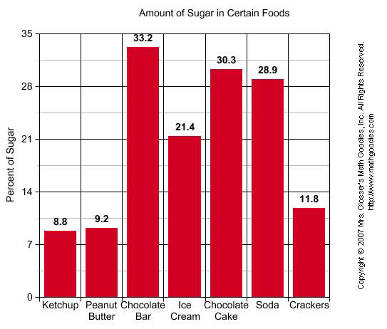
Teach your students how to create and interpret bar graphs

bar_graph_example3.jpg

Learning Intention / Overview

In this activity students will develop an understanding of bar graphs.  A bar graph uses horizontal or vertical bars to organize and display data for quick easy generalizations.  The bars represent amounts or qualities of things being compared.

Methods / Teaching Strategies

Individual Practice

Group Discussion

Personalized Learning Task

Assessment of Learning

Bar Graph Sheet (included)

Individualized Learning (Student Bar Graphs)

Performance Task 1 and 2

Click here to download the free 7 page lesson plan

Using Visual.ly in your maths lessons

If haven't already seen it visual.ly is the webs best collection of info graphics and basically a statisticians dream.  Visually takes any concept and breaks it down into the simplest key statistics and facts relating to thousands of topics.

As a maths teacher this offers a wealth of data to inform students and a great starting point to lead to larger mathematical questions.

For Instance the info graphic below is related to the explosion of Halloween Stores across the United States.  Take a look at this with your own students and do some of your own research in these areas to see how your students compare to the national average.  This will lead you to seek out further statistical information regarding your findings.

There are a multitude of options for using maths and writing in Visual.ly and it will really engage your students because it is current, topical and looks amazing.  Access it here.


GeoGebra Free mathematics software for learning and teaching

GeoGebra is free and multi-platform dynamic mathematics software for all levels of education that joins geometry, algebra, tables, graphing, statistics and calculus in one easy-to-use package. It has received several educational software awards in Europe and the USA.

Quick Facts

  • Graphics, algebra and tables are connected and fully dynamic
  • Easy-to-use interface, yet many powerful features
  • Authoring tool to create interactive learning materials as web pages
  • Available in many languages for our millions of users around the world
  • Free and open source software
  1. Get started with the Geogebra Introductory Materials
  2. Ask questions in the Geogebra User Forum
  3. Check out our ready-to-use Geogebra Learning Materials

GeoGebraWiki

is a free pool of teaching materials for the dynamic mathematics software

GeoGebra

. Everyone can

contribute and upload materials

! All contents of this pool may be used

free of charge

.

Create Graphs straight from your browser with ChartGo

What is it?: This is my pick of the week by a long margin.  Chartgo.com is a great resource for creating a range of graphs in seconds online.  You do not need to register which always proves a class concentration killer and offers a range of styles of graphs from simple through to complex.  There is more than enough here to satisfy the juniors through to tertiary maths students.  my only complaint about this is that you cannot embed your finished graph onto your blog or web space.  You can however add a link to your chart.

How can I use this in the classroom? There are a number of applications in maths, for chartgo particularly in the are of statistics and data.  You might start out small by simply completing a simple class survey and graphing the results through to a complex statistical record of events in physics or chemistry.

Give this a shot in your next maths lesson, look forward to hearing how you use have used Chartgo for your needs.

Lesson Plan: Creating a Pictograph

Welcome to the first of many video tutorials.  I have deliberately kept this weeks very simple as I am trying to learn some new technology myself.  Pictographs are a great maths lesson for junior students to explore graphing and data in the early years of schooling.  This video tutorial below explains all the steps to get you and your students to produce a pictograph in no time. The aim of these video tutorials is that you can sit back and learn alongside your students.  Enjoy and feedback is always appreciated.

Excellent web based generator for teachers and students

Create a Graph is very simple to use web based Graph Generator that I can highly recommend for younger students who may find a spreadsheet such as Excel a little daunting.  A very simple interface lets you select from Bar, Line, X&Y, Area and Pie graphs and takes you through each stage of the graph making process in simple to understand language.

There are examples and tutorials, not that you will need them and you can output graphs as either a traditional paper based printout or get a hyperlink to view your graph online.

Be sure to take a look at Create a Graph next time you are doing a statistics and data lesson with your kids and want to generate a graph simply whilst teaching your kids the steps required along the way.It's free of course with no sign up required and there are a few other useful tools to be found on this site also.

By the way if you are looking for a great lesson plan on Creating Pictographs on Computer with younger students.  Here is one from my lesson plan section.

Google Public Data Explorer - An excellent maths resource

Just found this today and I would definitely recommend taking a look at it with your students especially if you are looking at chance and data.

Google Public Data Explorer, a part of Google Labs experiments, is a tool that helps you explore through and visualize public datasets that are made available by government and other agencies that track stats, from around the world.

public data explorer 1

There are a number of datasets available. You can check out the government debt in Europe or visualize the unemployment rate in the United States, see how the US population is growing or the variations in prices of natural gases around the world.

It offers four kinds of visualizations for most of the datasets: line chart, bar chart, map or bubble chart. You can easily switch from one chart format to the other.

public data explorer 2

You could also compare the data for specific countries for datasets that aggregate data from an entire continent. For example, in the graph, I’ve compared the broadband penetration rate in specific countries in Europe.

public data explorer 3

The charts and maps can also be embedded in your website or blog. Overall, a nice tool for students and scholars and could definitely aid in their research on a topic.